 projects
Surge 'Rebrand'
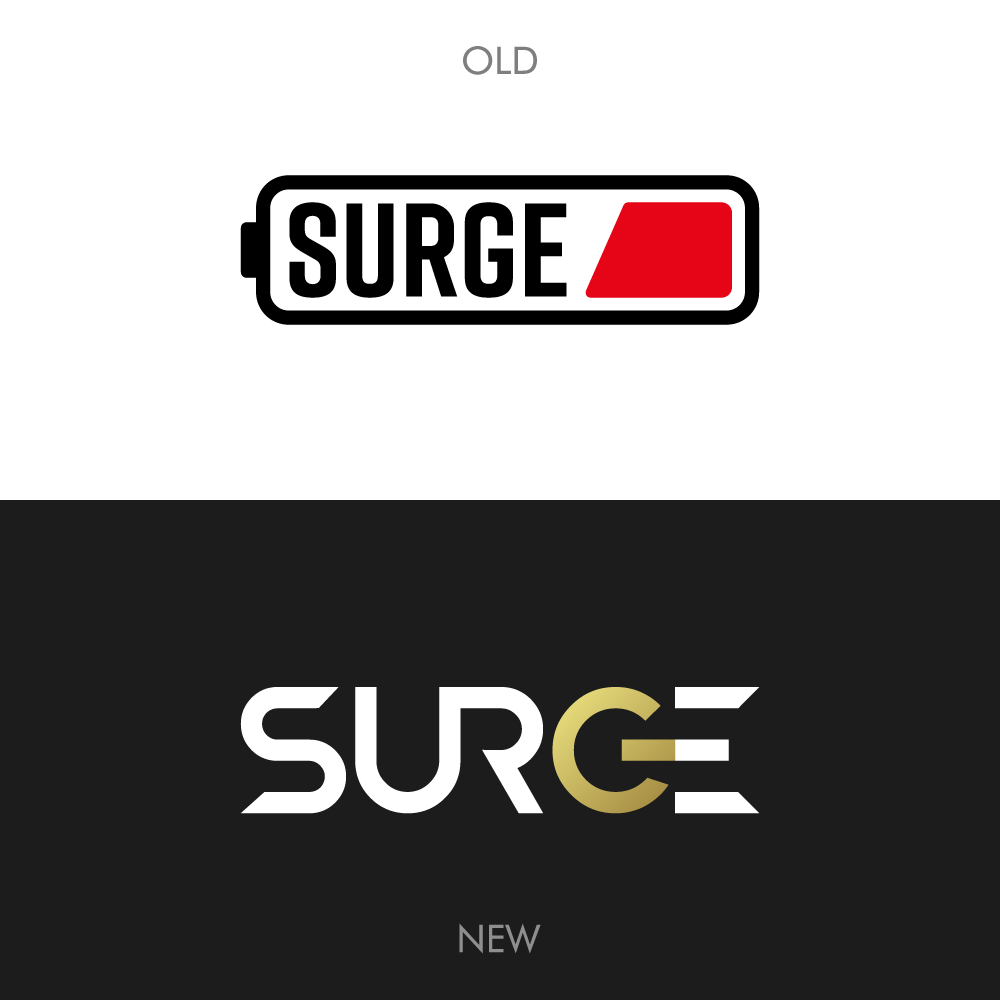
Surge wanted a rebrand of their logo. It was becoming to separated of their identity. Since they wanted to target a new audience which was more sided towards the upper market instead of the low/middle market. Since I worked with Surge before I was really excited to take on this challenge.


Design Choices
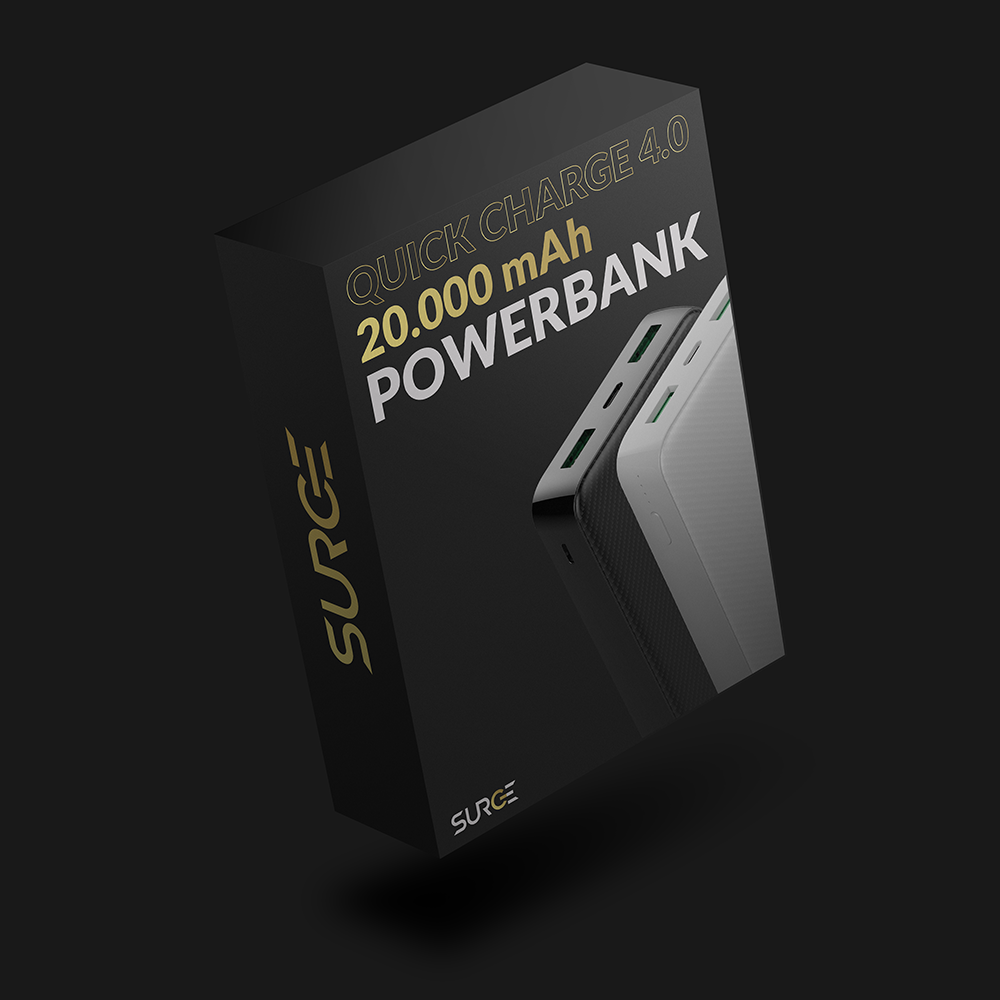
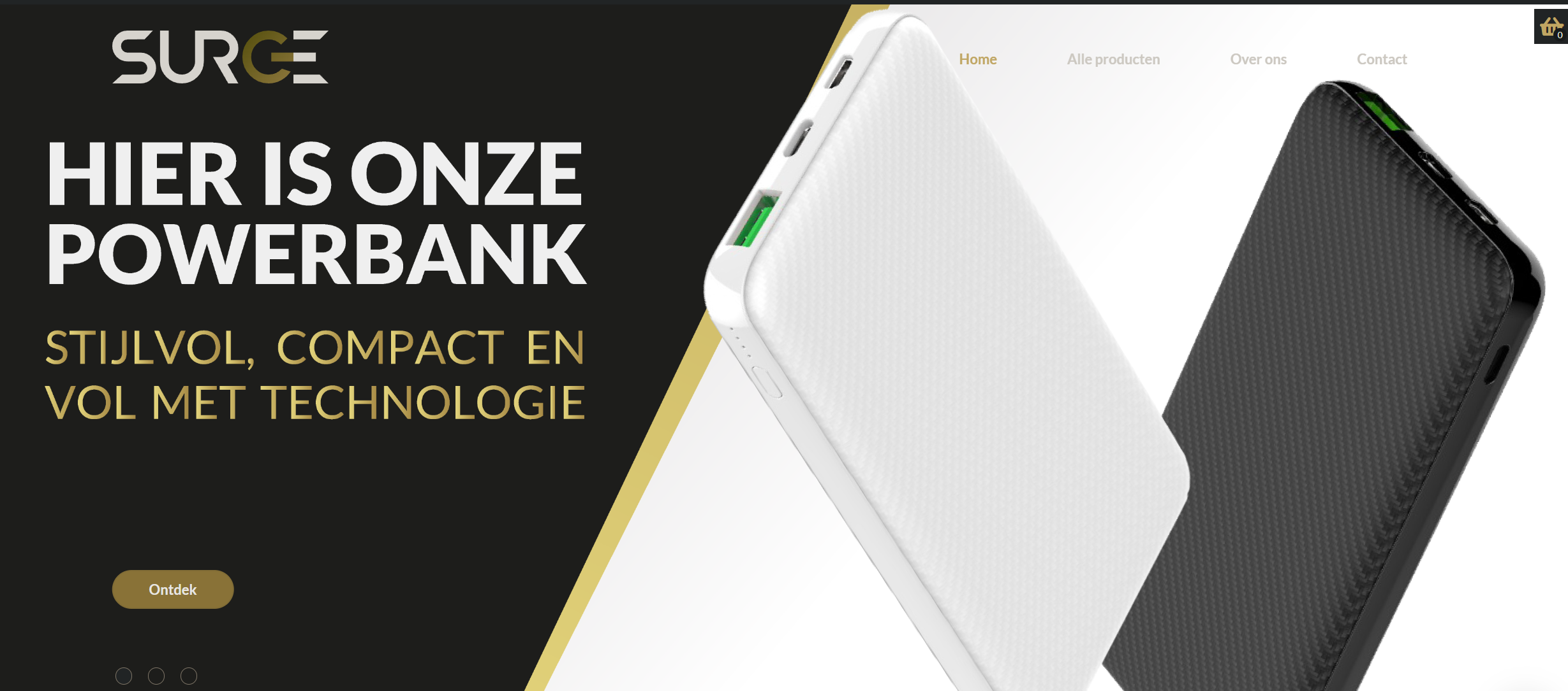
The Icon for the new Surge came out of the idea of the products that Surge provides to their customers. This being an on/off button which represents the electric devices and turning this into the letter 'G' while also adding a complementary gold color makes the whole logo come together.


- Details
- Client: Surge
- Team: None
- Year: 2022
- Primary Roles
- Rebrand
- Logo Design
- Branding
- Project Type
- Electronics
- Higher end
- Rebrand
- Links
- Visit Client
